
Brand kitLogo, colors and sound.
Everything you need to show Ovrdrive properly. Please use the files and do not retype the wordmark. We can tell.
The logo.
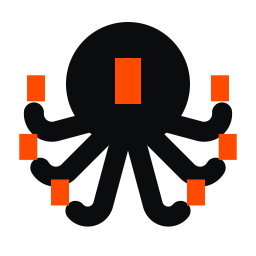
An octopus. One head, many arms: one operator with many hands. Its eye is the Block.



Four rules.
- Leave it roomClear space on every side, at least the height of the octopus's eye.
- Keep it legibleHorizontal no smaller than 120 px wide. Stacked 80 px. Symbol 40 px. Below 32 px, use the small cut in the kit.
- Two eye colorsOrange on white, grey and black. White on orange. In one-color use the eye is a hole.
- Leave it aloneNo stretching, rotating, recoloring, outlines, shadows or effects. Never on a busy image.
Color.
Black on white with one loud signal. No gradients, no tints, no second accent.
Text on orange is ink. White on orange is for large type only.
Type.
One family does the talking. Both typefaces are free under an open license.
Epilogue Black. Headlines.
Overhead is optional.
Epilogue Regular and Medium. Body.
Ovrdrive is a marketing system one person can run. All of it.
Geist Mono Medium. Numbers and data only.
6 modules · 1 seat · 0 status meetings
The Block.
A square-cornered bar that crosses out what Ovrdrive removes. It is also the octopus's eye.
- One blocked phrase per headline
- It always marks something removed or replaced
- It is never decoration, and its corners are never rounded
Graphic language.
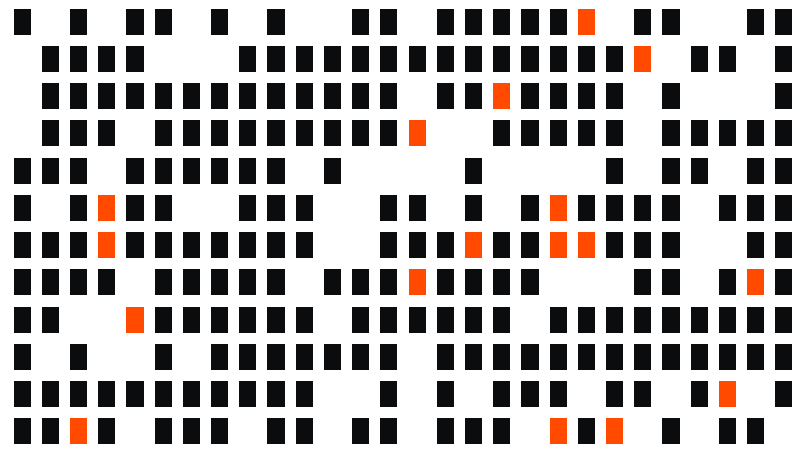
Everything is built from the logo's own shapes. Use one element per layout, besides the logo.

Sound.
Six rising notes, one per arm: A C D E G A. A steady pulse with layers stacking on top of it.
Motion.
Quick and direct. The Block wipes in from the left. The eye may blink. Nothing bounces.
The name, and a paragraph to borrow.
It is Ovrdrive. Capital O, no E after the V, no "the". Capitals are for the logo only.
If you need a short description, this one is approved:
Ovrdrive started as a fix for our own problem. We had marketing to do and nobody to do it, so we built a system that let one person run all of it. It worked better than hiring would have. Now it is a product: a marketing system built for one seat. Other departments are next. Run it with one.
Call it a marketing system. It is run by an operator, it has six modules, and it is sold by the seat.
Instead of: Hire a team.
Run it with one.
Pre-launch. We will email you when a seat opens.